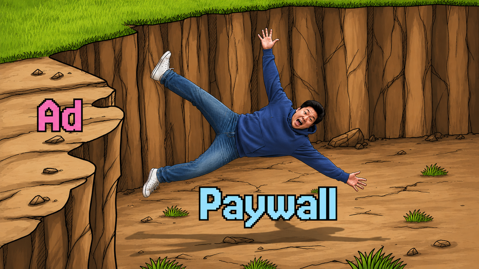


Paywall design doesn’t happen in isolation. The strongest-converting paywalls fit cleanly into a coordinated subscriber journey — ad → onboarding → paywall → retention — where every touchpoint reinforces the value of the upgrade. Subscription orchestration is the practice of stitching those moments together so the paywall doesn’t feel like a wall, but a natural transition. The principles below assume you’re designing within that broader system.
Key Elements of a Perfect Paywall Design
The design of your paywall plays a crucial role in converting visitors into paying subscribers. To achieve the best results, your paywall should focus on clarity, simplicity, and a person-centered approach. Below are the essential elements that contribute to a well-designed paywall.
-
Value Proposition: Clearly communicate the benefits of upgrading, such as exclusive content or advanced features. Use bullet points or icons for easy scanning, and keep the messaging simple and focused.
-
CTAs: Use action-driven phrases like “Unlock Premium” or “Start Free Trial.” The CTA button should stand out with a high-contrast color and focus on one primary action to avoid distractions.
-
Trust Signals: Include secure payment icons (e.g., SSL, Apple Pay), reviews, or a money-back guarantee to build trust and reassure people about their purchase.
-
Minimal Disruption: Ensure the paywall feels like a natural part of the app, appearing at appropriate times. Avoid intrusive pop-ups and aim for smooth transitions that don’t interrupt the experience.
-
Design Consistency: Keep the paywall’s design consistent with the rest of the app by using the same fonts, colors, and branding elements. A clean, minimalist design focused on the value and CTA helps drive conversions.
-
Urgency Elements: Add urgency with phrases like “Limited-time offer” or “Upgrade now to get 50% off.” Scarcity cues can push people to take immediate action.
Read more: Fitting paywalls to user context
How to Design a High-Converting Mobile App Paywall: Step-By-Step
1. Simplicity in Layout
A clean and simple layout is the foundation of an effective paywall design. Overly complex or cluttered paywalls can overwhelm visitors, leading to confusion or abandonment. A minimalistic design with a clear focus on the value proposition and the call-to-action (CTA) button keeps attention on the primary goal: conversion.
- Use a single column layout: This reduces cognitive load and guides people toward the action you want them to take.
- White space: Employ ample white space to separate different sections and make the design feel uncluttered and professional.
- Responsive design: Ensure that your paywall scales effectively across different devices and screen sizes, especially since mobile apps are used on various types of smartphones and tablets.
2. Visual Hierarchy: Lead with Benefits
Effective paywall design uses visual hierarchy to guide the eye toward the most important information. The key elements—value proposition, pricing, and CTA—should be prominently displayed in order of importance.
- Bold headlines: Use bold, large fonts for the paywall title that instantly communicates the value, such as “Unlock Exclusive Features” or “Go Ad-Free.”
- Feature highlights: Present the benefits of upgrading in an easy-to-scan format, like icons or short bullet points. This section should quickly answer the visitor’s question, “What do I get if I pay?”
- Contrast in CTA button: The call-to-action button (e.g., “Subscribe Now” or “Start Free Trial”) should be the most prominent element on the screen, with a high-contrast color that stands out from the background and other elements.
3. Typography: Clarity and Readability
Typography plays a vital role in how information is absorbed. Your paywall should use legible fonts that are consistent with your app’s overall branding.
- Font hierarchy: Use a distinct font size for headings, subheadings, and body text to create a clear reading flow.
- Readable text: Avoid overly stylized fonts; stick to modern, sans-serif fonts that are easy to read on all screen sizes.
- Alignment: Left-align text for better readability, especially for descriptions and lists of features.
4. CTA Button Design
The call-to-action (CTA) button is the most important element on your paywall. Its design should draw immediate attention and encourage people to take the desired action.
- Color contrast: Choose a color that contrasts with the rest of the paywall but still complements the overall app design. For example, if your app uses a blue color scheme, a bright green or orange CTA button would stand out.
- Actionable text: Make the CTA button text actionable and clear, such as “Upgrade Now” or “Start 7-Day Free Trial.” Avoid generic terms like “Submit” or “Continue.”
- Size and placement: Ensure the CTA button is large enough to be easily tappable, especially on smaller mobile screens. It should be placed near the bottom of the screen but still visible without scrolling in most cases.
5. Visual Elements and Branding
Consistency in visual branding across the app and the paywall is crucial for maintaining a cohesive experience. Your paywall should feel like an integrated part of the app, not an external pop-up.
- Brand colors: Use your app’s brand colors to reinforce the connection between the paywall and the rest of the app. However, make sure the CTA button uses a contrasting color to stand out.
- Images and icons: Visual aids, such as icons or images, can help reinforce the benefits of upgrading. For example, if upgrading offers ad-free viewing, a simple icon showing an ad with a strike-through can quickly convey that benefit.
- Illustrations or mascots: If your app uses custom illustrations or characters, incorporate them into the paywall to make it feel more familiar and friendly.
6. Effective Use of Imagery
While the focus should be on clarity and simplicity, the right imagery can enhance the appeal of a paywall. Be mindful of how images or illustrations are used, as they can either help reinforce the message or distract from it.
- Hero images: If your app has a hero feature (e.g., premium video content or advanced features), consider using a large image to visually communicate what people gain by upgrading.
- Avoid stock photos: Authenticity is key. Stick to branded imagery or illustrations that align with your app’s personality, rather than generic stock images that may feel disconnected from the experience.
7. Progressive Disclosure of Information
Instead of overwhelming visitors with too much information all at once, consider revealing the most important information up front, with the option to learn more.
- Expandable sections: Use collapsible sections or tabs for additional details, such as a breakdown of premium features or FAQs.
- Dynamic content: Use content that adapts based on engagement. For example, after a few interactions with the app, show a personalized paywall based on the features someone has engaged with most.
8. Animations and Transitions
Subtle animations can add polish to your paywall, making it feel more engaging without distracting the visitor.
- Smooth transitions: Use gentle fade-ins or slide-ins for your paywall screen to make it feel like a natural part of the app experience, rather than a disruptive pop-up.
- Button feedback: When people tap the CTA button, provide visual feedback (like a color change or slight scale increase) to confirm that the action has been registered.
9. A/B Testing Your Design
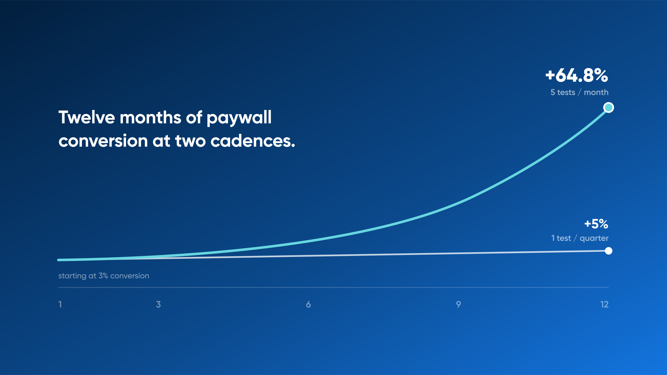
Once your paywall is designed, continuous optimization through A/B testing is crucial to improve conversion rates — and shipping paywall tests at velocity is what compounds those gains over time.
- Test different layouts: Experiment with different arrangements of elements, such as trying vertical vs. horizontal layouts or testing the placement of the CTA button.
- Try multiple messages: Test various headlines, benefit lists, and CTA button texts to see what resonates most with your audience.
- Optimize based on data: Use analytics to track where people drop off in the paywall process and adjust the design accordingly.
To make A/B testing easier and more efficient, try Nami’s no-code experimentation engine, trusted by Fortune 100 subscription teams. Run paywall variants across CTV, web, and mobile without a code release, and tie results back to the surrounding subscriber journey instead of just the paywall in isolation.
5 Expert Paywall Design Tips for Success
1. Use 1 primary color to draw attention to the purchase CTA
Color is a powerful design element. Too little color can be boring. Too much color can mean the visitor doesn’t know where to look.
Use your brand color or primary app color sparingly on the paywall to draw attention to the purchase action.
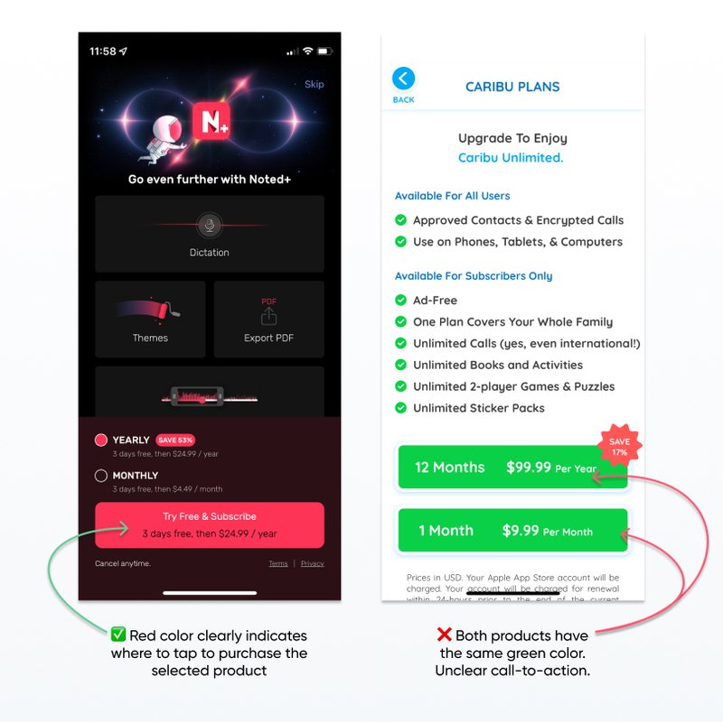
Pro tip: squint at your paywall or use an image editor to apply a thick blur effect to it. What elements still stand out? Where is your eye drawn? If there are multiple elements competing for attention even when squinting or blurred, you don’t have a clear call to action. Reduce design elements or use of color until it is more clear.
2. Avoid lots of lines to read
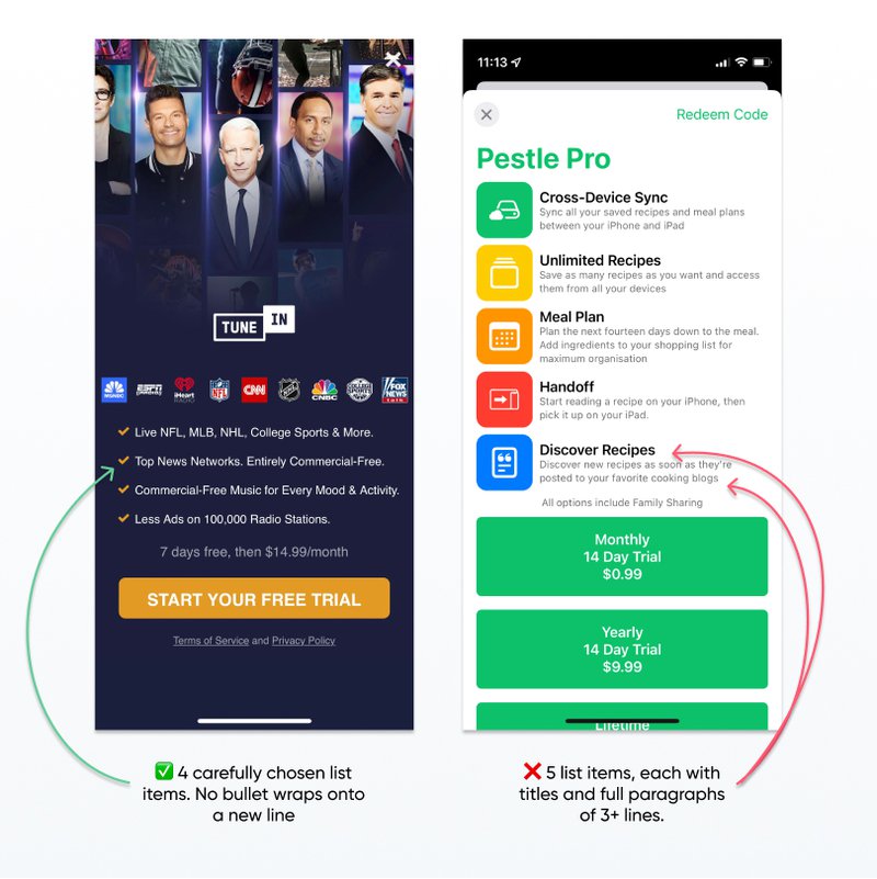
People are skimming your paywall on their phone. They don’t want to read through paragraphs of copy, even if the copy is really well written. Stick to a few lines of carefully written copy like an ad, and use short bullets to spell out the benefits of your product.
If you are using a checklist on your paywall, limit the bullets to no more than 7 and experiment with the items and order of the bullets to improve optimization rather than adding more copy.
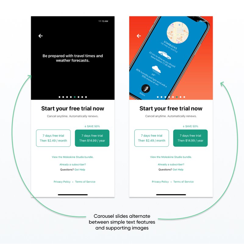
3. Use a Carousel to allow people to quickly swipe through features and benefits
Also known as a gallery or a slideshow, a carousel is a component composed of multiple “slides.” Slides are made up of text, photos, and even video. People can use their finger to swipe through the slides, or carousels can automatically advance through slides.
To create a carousel, first add catchy imagery and short, clear copy for each slide. Then optimize your carousel by testing the order of the slides and the number of slides shown.
Pro tip: if someone taps to unlock feature A, make sure that feature A is explained on the first slide in the carousel. That way the value prop is clear and they don’t have to swipe to search for it.

4. Include a way to close the Paywall
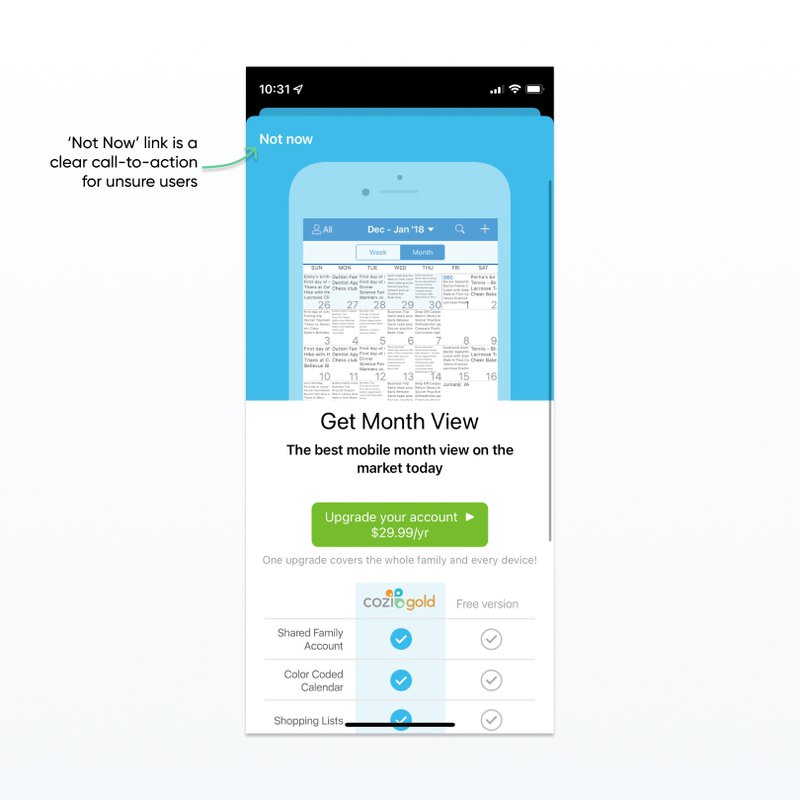
People typically need to see a paywall several times before they’re ready to buy. Don’t force a decision right away, or they may close your app and never come back.
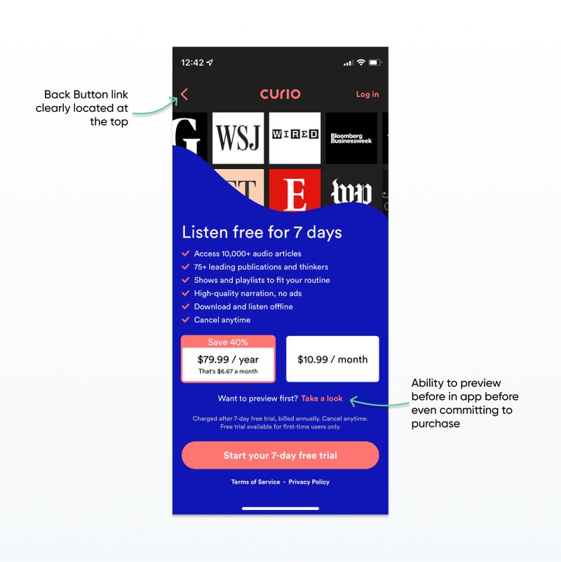
Paywall design best practices include an ‘X’ or ‘<’ icon in the top menu bar or a link that says ‘Close’, ‘Later’, or ‘Not Now’.
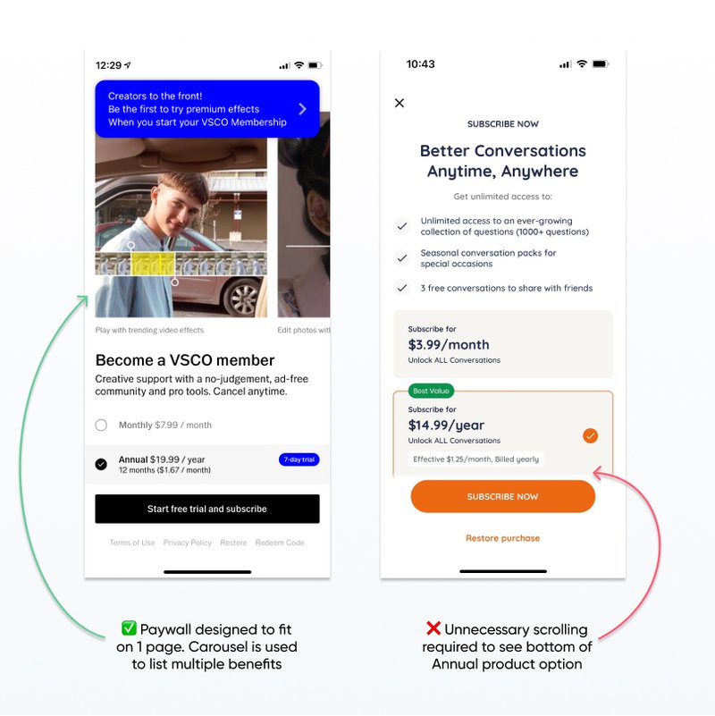
5. Make a choice between a scrolling and a fixed-height paywall
Scrolling can distract from the decision. Only use this pattern if you have lots of quality content to display.
If you don’t need your paywall to scroll, test and optimize your paywall for devices of all sizes so that there isn’t a scrollbar when there doesn’t need to be. Try reducing whitespace and text size in order to get everything to fit.
Looking for more tips on paywalls? Talk to our team for a tailored review of your subscriber journey.
Design Tools for Mobile App Paywalls
Designing a high-converting paywall is a blend of strategy, design precision, and the right tools to execute your vision. Whether you’re focused on layout, A/B testing, or the experience around the paywall, a few tools make the work faster. Here are some worth knowing:
1. Nami Designer
Nami Designer is Nami’s no-code editor for designing paywalls (and onboarding, upsells, and other subscriber-facing surfaces) across CTV, web, and mobile. It pairs a drag-and-drop editor with built-in experimentation and analytics so you can ship variants, measure them in context of the surrounding subscriber journey, and update without an app release. Nami Designer is one capability inside Nami’s broader subscription orchestration platform — paywall is one screen of many that need to coordinate.
- Best for: No-code paywall design, in-context A/B testing, and real-time optimization across platforms.
- Key features: Drag-and-drop editor, integrated experimentation, contextual insights, support for iOS / Android / web / CTV, real-time updates without app resubmission.
2. Sketch
Sketch is widely used for designing user interfaces tailored to mobile apps. Its vector-based design makes it easy to scale your paywall for different screen sizes without losing quality. Sketch is also known for its easy-to-use symbol and library system, which helps ensure consistency across different versions of your paywalls.
- Best for: High-fidelity UI design, prototyping.
- Key features: Vector editing, reusable design components, mobile-optimized layouts.
3. Figma
Figma offers real-time collaboration, making it an ideal choice for teams working together on paywall designs. Its component system allows you to create consistent, reusable UI elements, which is essential when designing paywalls for different screen sizes and devices.
- Best for: Team collaboration and multi-device prototypes.
- Key features: Cloud-based, real-time collaboration, design system management, and vector networks.
Read more: Paywall placement
Conclusion
Designing a successful paywall requires a careful balance of experience, timing, and psychology. A well-designed paywall not only helps monetize your app but also improves the experience by offering premium content in a way that feels rewarding. Continuously optimize the paywall design and functionality to ensure maximum conversions.
But the best-converting paywalls aren’t the ones designed in isolation — they’re the ones designed as one moment inside a coordinated subscriber journey. If you’re rethinking paywalls because the surrounding experience is leaking, that’s subscription orchestration, and it’s what Nami’s platform exists to coordinate. See how it fits together, or talk to our team about your funnel.