Blog post
The Paywall Experiment Velocity Gap: Blame the Release Cycle
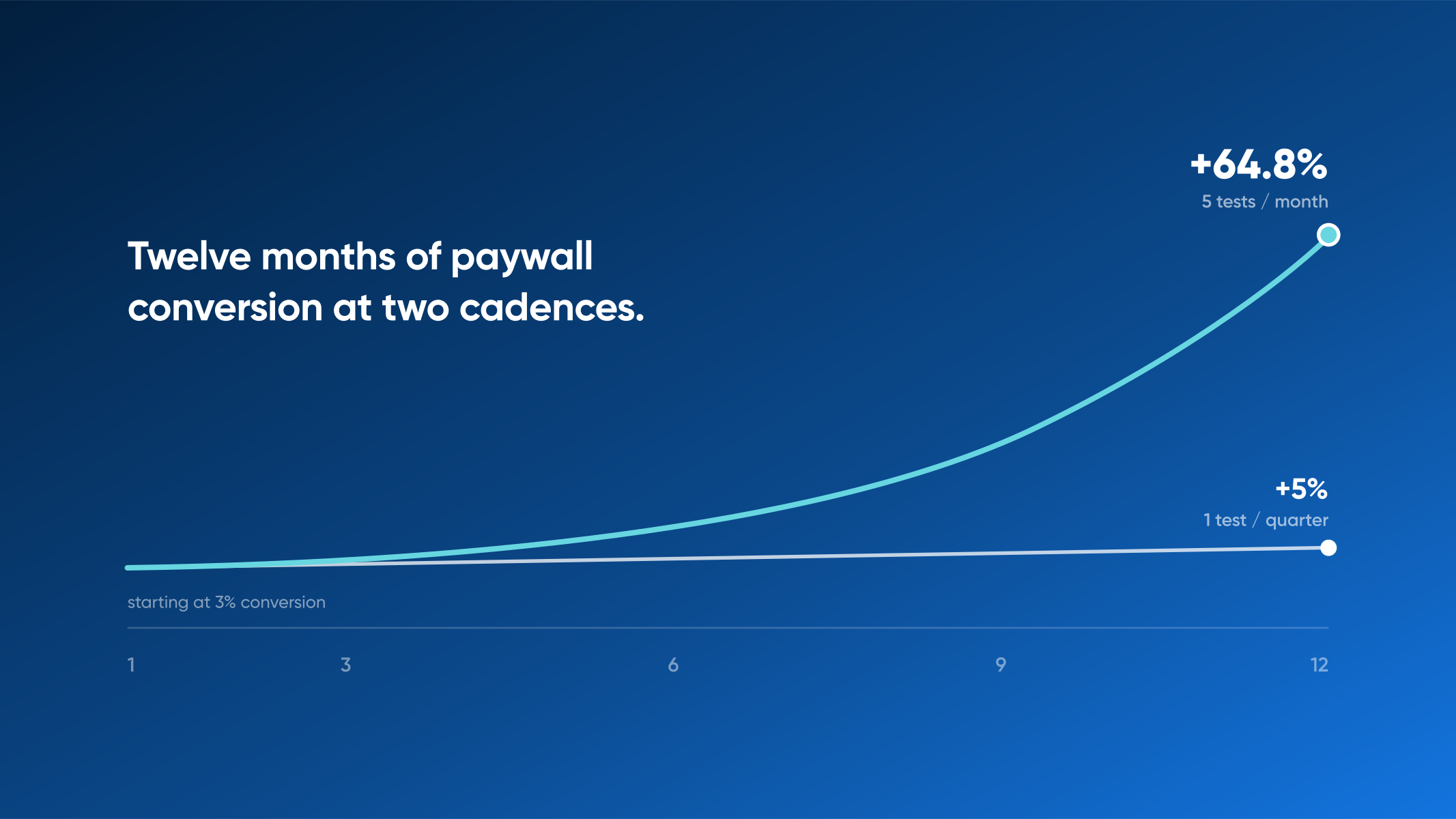
Most subscription teams know what to test. The bottleneck is the release window. Here's how A/B testing paywalls without an app release changes the math.
Everything we ship across Pages, Flows, Experiments, Campaigns, Insights, and the platform underneath.
Your Control Center preferences now persist to your account, so your workspace looks the same on every browser and device.
Preferences like your selected app, preview platform, sidebar state, and list sort and view choices now persist to your account instead of a single browser. Log in anywhere and your workspace picks up right where you left off — same setup, every browser, every device.
Author-inserted line breaks in paywall text now preview exactly as they render on device.
Insert intentional line breaks in paywall titles and other text and see them render faithfully in the page preview, matching SDK behavior on device. No more guessing how a multi-line title will wrap — what you design is what subscribers see.
See, resend, and revoke pending team invites — and re-inviting someone refreshes their existing invite instead of creating duplicates.
Admins can now see who’s been invited to their organization, by whom, and when each invite expires. Resend an invite in one click, revoke stale ones, and stop worrying about duplicates — re-inviting the same person refreshes their existing invite instead of generating a new link and email.
Set a brand color palette once and new Page Builder components come in on-brand, with an optional per-page override.
Designate a brand color palette once and the Page Builder colors new components from it automatically — buttons, text, and containers come in on-brand out of the box, with an optional per-page palette override. It cuts the repetitive color setup when building paywalls. (Applies to V3 paywalls.)
Duplicating a page now records the source page in its version history, so you can trace where it originated.
When you duplicate a page, its version history now names the source page (“Duplicated from …”) instead of a generic template label — making it easy to trace exactly how a page originated.
Manage value-prop bullet lists as reusable assets and drop them into any paywall — edit once, update everywhere.
Teams can now manage value-prop bullet lists as first-class, reusable assets and drop them into paywalls without re-typing. Edit the list once and every paywall that references it updates.
Page through the Team Members list and search by name or email to manage teammates as your org grows.
Admins managing bigger teams can now page through the Team Members list and search by name or email — finding and managing the right teammate takes seconds, even as your organization grows.
Quickly preview App context on the page with a single click using the new Apply Defaults button
Page Builder authors can now preview a page with realistic App Context data in one click via “Apply Defaults.”
Rename a flow right from the Flow Builder toolbar — no detour, no risk to unsaved canvas work.
You no longer have to leave the canvas to rename a flow. Click the title in the Flow Builder toolbar, type the new name, and keep building — the rename saves instantly without touching your unsaved canvas work.
The Page Builder tree's "+" add-component button now stays pinned to the drawer edge, so long component names can't push it out of view.
The ”+” add-component button in the Page Builder Structure tree now stays pinned to the right edge of the drawer, so you can add children to components with long names that previously pushed the button out of view.
Archived pages, flows, products, and placements now show a clear banner with one-click Restore, and table name/actions columns stay in view.
Archived pages, flows, products, and placements now show a clear banner with one-click Restore, and the main tables keep the name and actions columns in view while scrolling — making large lists easier to work with.
Pick a solid color, gradient, or transparent background for the loading state of any paywall — right from Page Settings, no code required.
Page authors can now set the background color — solid, transparent, or gradient — shown while a paywall loads, for a smoother branded launch experience. Configured directly in Page Settings, with no client code changes required and a sensible black default.
Designate your go-to color palette once and the Page Builder color picker defaults to it — fewer clicks, on-brand by default.
Teams can now designate their go-to color palette once in Brand Styles, and the Page Builder color picker defaults to it on open — cutting clicks when styling paywalls and keeping every new component on brand. This is the foundation for auto-applying brand colors to new components, coming next.
Publish flow blueprints with placeholder Paywall slots and create new flows from them in one click — every flow tracks back to its template.
Product teams can now publish flow blueprints with placeholder Paywall slots, share them across the org, and create new flows from a template in one click — every new flow tracks back to the template version it came from. That cuts the time to launch a variant flow from minutes of click-around to a single picker step.
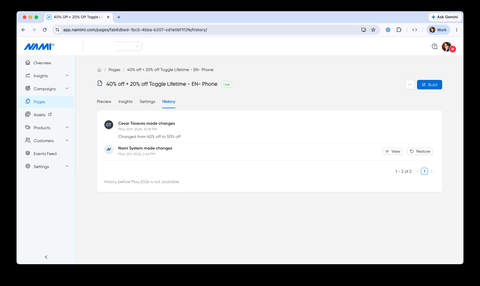
Resource history timelines now distinguish the original creation from later edits — so it's obvious who created a page, flow, or asset.
History timelines for pages, flows, and assets now distinguish the original creation from later edits, so it’s obvious at a glance who created a resource versus who changed it.
Archive controls across Pages, Campaigns, Placements, Flows, Products, Assets, and Insights now use a dedicated archive icon.
The archive controls and archived-state indicators across Pages, Campaigns, Placements, Flows, Products, Assets, and Insights now use a dedicated archive icon, making it clear at a glance that archiving an item is reversible and distinct from deletion.
Content Feed is now a component you add from the Components tab, gated by your plan and prompted for a data schema.
Content Feed is no longer a separate capability you toggle on — it’s a component you drop in from the Components tab or the Add Component popover, gated by your plan and prompted for a data schema the first time you add it. One less concept to learn, fewer clicks to ship dynamic content.
Deeplink Button and Carousel are now components you drop in from the Components tab, not separate Capabilities to toggle.
Deeplink Button and Carousel are no longer separate Capabilities to toggle — drop them in from the Components tab or the Add Component popover, gated by your plan. The Capabilities drawer is now exclusively for behaviors, not components, making it easier to find what you’re looking for.
Creating a flow now opens the Builder directly with your chosen name — no settings detour.
Creating a flow now opens the Builder directly with the name you chose — no settings detour, no extra clicks.
Group Content Feed and Content Grid items into named buckets at render time — pick a field, keep your data source flat.
Operators can now bucket Content Feed and Content Grid items into named groups (e.g. games by day, articles by category) directly from the Page Builder. Pick a field, configure the auto-generated Group Header, and Nami groups items at render time — customers keep their flat data source intact and the SDK does the rest. Works on Phone, TV, Apple, Android, Web, and Roku at min SDK 3.4.0.
The Page Builder header now reserves iOS safe-area space exactly as the Apple SDK does, so previews match the live app.
When designing paywalls in the no-code builder, the header now reserves space for the device safe area exactly as the Apple SDK does at runtime — so what you see in the preview is what your subscribers see in the app. No more pixel-level surprises after deploy.
Preview paywalls that branch on launch context using typed number and boolean values — no raw JSON editing.
When previewing paywalls that branch on launch context, builders can now feed in numbers and booleans directly from the preview menu instead of editing raw JSON — making it faster to verify condition rules like “premium === true” or “trialDays > 7” without leaving the canvas.
Flow templates can now resolve productGroupId, campaignPlacement, campaignExternalSegment, and objectId from autocomplete.
Flow templates can now resolve {{ productGroupId }}, {{ campaignPlacement }}, {{ campaignExternalSegment }}, and {{ objectId }} from the autocomplete, matching the variables the SDKs already expose at runtime. Customers building dynamic Flow content no longer have to remember the variable names by hand.
Build campaign audiences by Device Created Date — target new installs or long-time devices by exact date or relative age.
Campaign audiences can now include a Device Created Date filter, so you can target brand-new installs, long-time users, or any window in between — using a friendly date or “within the last N days/weeks/months” picker, with no SDK or code changes.
A refreshed color picker in Page Builder for faster, more precise color selection.
The Page Builder color picker has been rebuilt for clearer controls and a tighter workflow — quicker swatching, more readable hex/HSL inputs, and a layout that gets out of the way of the canvas.
Turn any text or image inside a Page into a shared asset without leaving Page Builder.
Page Builder now offers a one-click action to promote any text or image inline on a page into a shared asset. Reuse the same copy or image across every paywall without copy-pasting — and pick it up in the Assets library the moment it’s created.
Export the full list of pages from the Control Center to CSV.
The Pages list now exports to CSV, so teams can audit what’s live, hand off inventory to a partner, or pull a snapshot into a spreadsheet without copying rows by hand.
Toggle the platform you're previewing right on the Flow canvas — the same control already in Page Builder.
The Flow Builder now lets you switch the preview platform without leaving the canvas. Validate how a flow renders on phone, tablet, web, or CTV from the same view, then jump back to editing.
New date range presets in Insights charts to speed up routine reporting.
Insights charts pick up additional date range presets, so common reporting windows are a single click instead of a custom-range pick.
Open Control Center pages in new tabs to run multiple Nami workspaces side by side.
Every page in the Control Center can now be opened in a new browser tab, so teams can compare two paywalls, audit an experiment while editing a flow, or keep reference docs open alongside the work — without losing their place.
See Revenue and Conversion deltas vs. the prior period right on the Overview screen.
The Overview screen now surfaces Revenue and Conversion change vs. the prior period alongside each stat. See whether a launch moved the needle without leaving the home screen.
Copy, delete, hide, and group components in Page Builder with keyboard shortcuts.
Page Builder now supports keyboard shortcuts for copying, deleting, hiding, and grouping components. Move through a complex layout the same way designers work in their other tools — keyboard first, mouse only when you need it.
Preview promotional and introductory offer pricing with real prices, right inside Page Builder.
Page Builder previews now resolve real prices for promotional and introductory offers, so the page you’re designing matches what subscribers will actually see at checkout. No more guessing how a 50% off intro will render against a localized price.
Smaller refinements that add up — collapsible menu shortcut, sticky last-used state, and a faster, more secure Control Center.
A bundle of refinements landing alongside the Spring 2026 release:
[ and ] keys.Reorder Pages, annotate the canvas, and navigate complex Flows at a glance.
The Flow canvas picked up three upgrades for orchestrating complex journeys.
Open any earlier version of a Flow in read-only mode, then restore it if you need to.
Open any earlier version of a Flow in read-only mode from the History tab — see exactly what changed without touching the version that’s currently live.
Restore the right version with one click if the wrong change shipped. Pairs cleanly with the new drag-and-drop reorder so getting a Flow back to where it was before is fast.
Annotate every Paywall Builder save with a changelog note, then roll back to any prior version in one click.
A full history of changes to every Page is now available — see who made each change, when, and the changelog note they left. Open it from Page Settings → History.
Every save can be annotated with a description of what changed, so the next person looking at the page sees the context, not just the diff. Open any earlier version to compare what changed, and restore it in one click if a change shipped that shouldn’t have.
Page change history is available for all changes made after May 12, 2026.
Catch broken Flow Builder steps before subscribers do.
Flow Builder now surfaces error states when an action has no next step or when a page has empty or unattached actions. Teams see exactly where a flow is incomplete before publishing, so subscribers never land on a dead end.
Get warned before changing a page used inside an active flow.
The dashboard now warns teams before editing a page that is attached to a flow. Edits to a flow page can ripple across the subscriber journey, so Page Builder confirms the impact before letting the change through.
Configure Nami Insights environment settings from a streamlined gear menu.
The environment selector in Nami Insights has been replaced with a gear settings menu. The new control surfaces configuration options more cleanly, reducing visual clutter and making it faster to switch between environments without navigating away from your data.
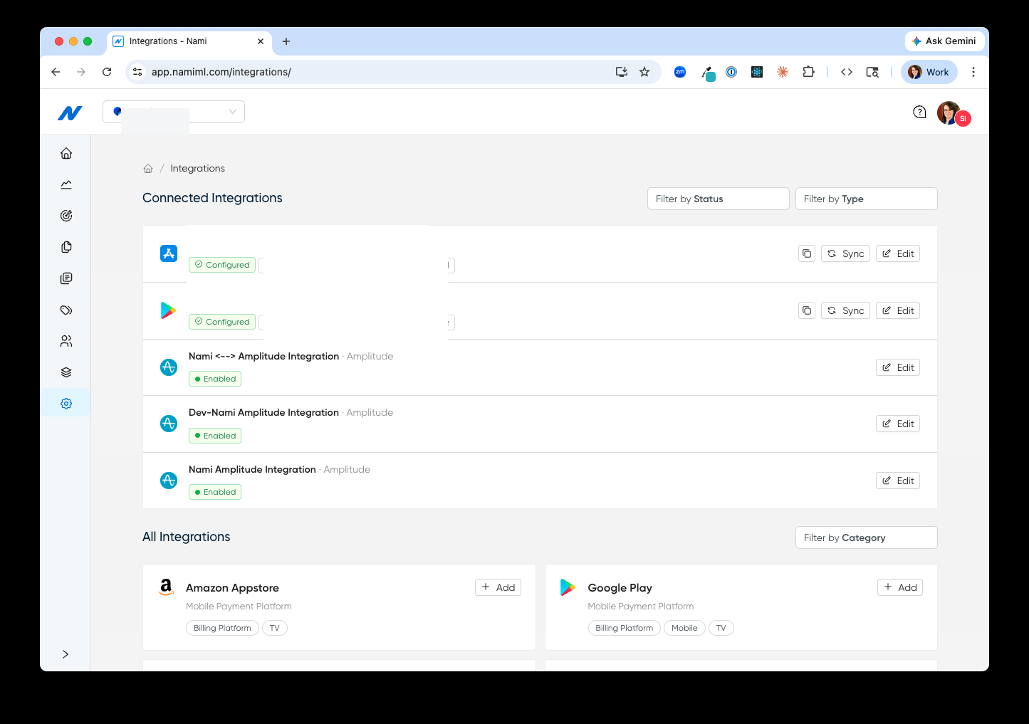
A redesigned Integrations page built to support many integrations, with quick sync and one-click access to platform IDs.
The Integrations page has been redesigned to better support teams running many integrations at once. Connected integrations now surface their status, platform IDs, and a sync action right on the row — so kicking off a re-sync or grabbing an app store ID for development no longer means digging through configuration.
A separate “All Integrations” section lists everything Nami can connect to, filterable by category, so adding the next integration is a single click.
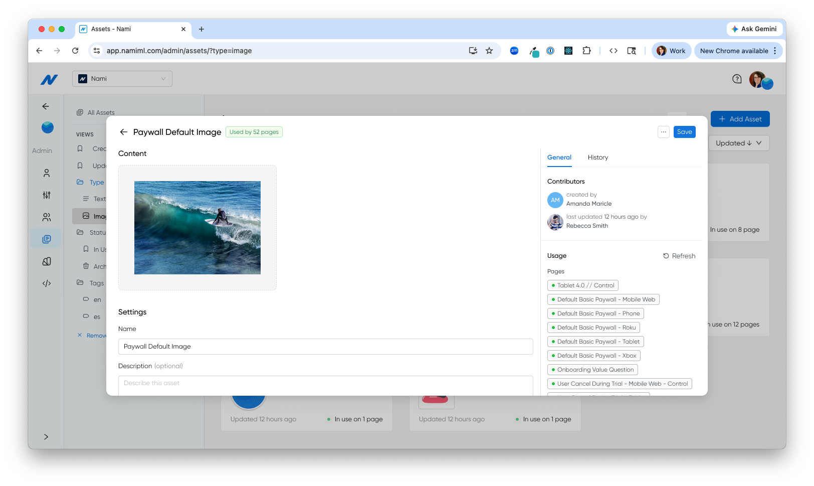
See every page using a shared text or image asset before you edit it.
Open any shared text or image asset and the detail view now lists every page that references it. Teams can gauge the impact of a copy change or image swap before making it, instead of discovering it live on a paywall.
The same usage signal drives the in-use filter in the redesigned Assets list and disables the archive action when an asset is still wired into a page.
Edit and archive assets faster from the redesigned list
The assets list now uses icon-based edit and archive actions with consistent column widths. Archive is disabled automatically when an asset is still in use, so teams can clean up the library without worrying about breaking a live page.
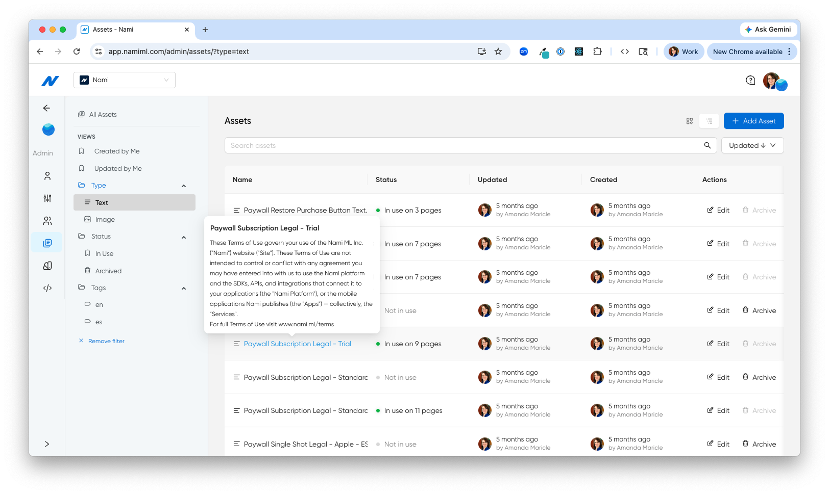
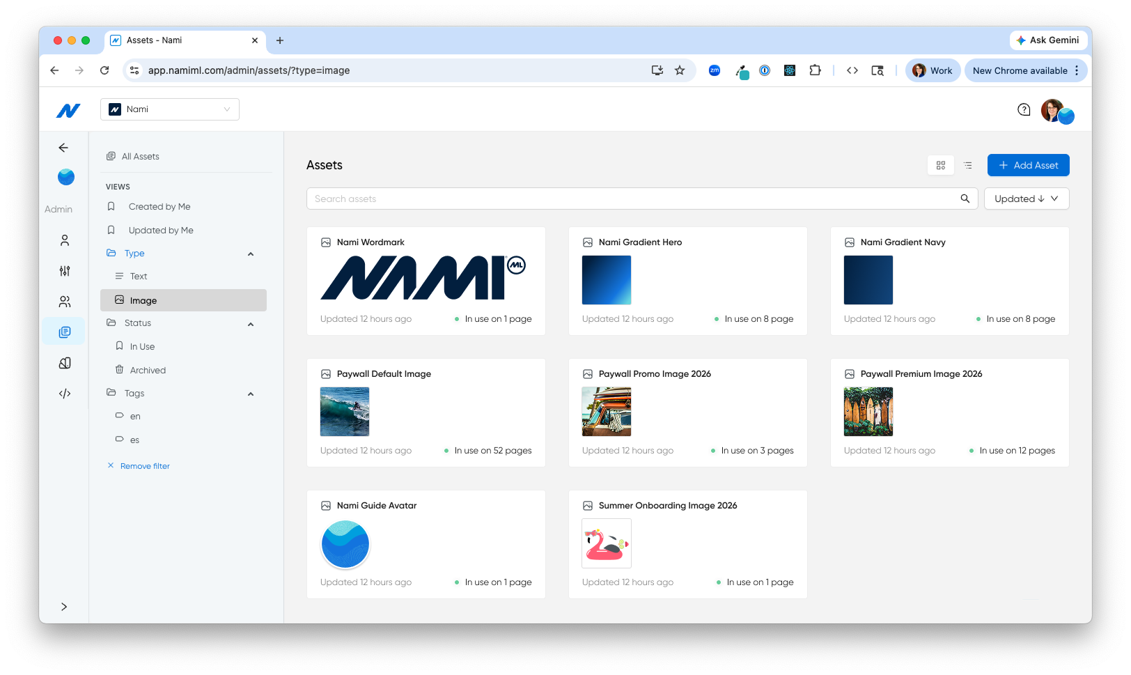
A file-explorer experience for managing assets at scale
Assets have a new home: a filterable table and grid view with click-to-edit modal overlays, plus a full-height sidebar layout that other dashboard pages will adopt next. Built for teams managing hundreds of assets across dozens of experiences.
Filter the library by type, by tag, or by whether an asset is in use — so the right asset is one click away whether you’re looking for a specific image, cleaning up archives, or auditing what’s referenced live.
See every page using a brand palette before you edit it
Brand palettes now show a usage list inside the palette detail view, surfacing every page that references a palette in one place. Teams can gauge the impact of a color change before making it, instead of discovering it live.
A cleaner, more consistent data schema table
The data schema table now matches the assets table layout, with avatar-based Created and Updated columns and a dedicated Actions column with quick edit. One less inconsistency between dashboard surfaces, one less thing to re-learn.
Give brand designers focused access with the new Designer role
A new Designer role in the dashboard gives team members access to fonts, color palettes, and design assets without exposing analytics, campaigns, or billing. Brand contributors can manage visual identity while product and growth teams keep control of the rest.
Flow list columns now match the rest of the dashboard
The flow list Created and Updated columns have been consolidated to show author avatar and date in a single cell, matching the assets table. Teams scanning across surfaces now see the same pattern everywhere.
Detach a text asset from a page with one click
Hovering over an asset reference in Page Builder’s text input now reveals an unlink icon. Click it to replace the reference with its current text value, useful when a page needs to diverge from a shared asset without losing the copy. The action is undoable.
Inspect every previous version of a data schema in history
The data schema history tab now shows the full JSON of each previous version alongside the changelog message. Audit how a schema has changed over time without restoring or rebuilding, and see exactly what was different at each step.
Pricing displays now reflect Android's latest one-time purchase format
Adapted to Android’s updated one-time purchase pricing API. Pricing on subscriber-facing pages stays accurate and current with the latest Google Play format — no manual adjustments required when Android changes how prices are structured.
Display content in a grid format alongside your existing feeds
Pages now support a content grid as a layout variant of the content feed. Teams can choose between feed and grid formats to match the visual style of each experience — giving more control over how content appears to subscribers without building from scratch.
Manage structured data assets directly in the dashboard
A new assets section in the data schema interface gives teams a dedicated space to manage structured data assets. View, organize, and reference data assets without leaving the dashboard.
Pricing data in the dashboard now loads significantly faster
Optimized the pricing data endpoint that powers SKU pricing displays in the dashboard. Load times that previously took several seconds are now much faster, making it quicker to review and manage subscription pricing.
Launch experiences without an in-app purchase option
Launch context now supports a noInAppPurchase option. Teams can present subscriber experiences — announcements, content unlocks, upsell screens — without surfacing an IAP prompt when one is not needed, giving product teams finer control over when the purchase flow appears.
Content feed setup now starts with a ready-to-use component
When adding content feed capability to a page, a starter component is now included automatically. One less manual step in the build process — teams go straight to customizing instead of starting from an empty container.
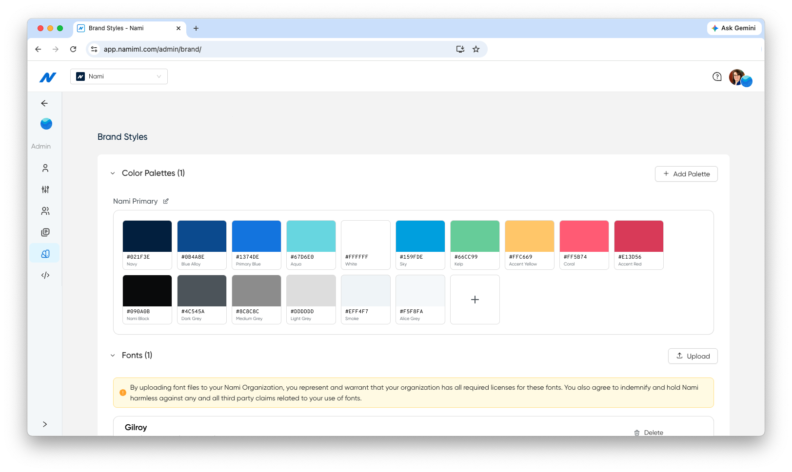
Set up standard color palettes and fonts for one-click application to every Paywall
A new Brand Styles page in the dashboard brings fonts, color palettes, and design assets into one place. Configure your brand’s approved colors once, then apply them to any Paywall with a click — no more hunting for hex codes or copying values between pages.
Teams can manage the visual system that underpins every page and flow from one view, so updating typography or swapping a palette ripples through every page that uses it.
Sample any color from the canvas with the new eyedropper tool
Page Builder color picker now includes an eyedropper tool. Sample any color from the canvas and apply it directly — faster than switching to a design tool to grab a hex code.
Customize screenreader text on individual TV paywall elements
Page Builder now lets teams manually add screenreader text to individual TV paywall elements beyond the auto-generated defaults. Fine-tune accessibility for specific components when the automatic text doesn’t capture the right context.
Control which offers subscribers see based on entry point
Apple and Android SDKs now support sending the current product group dynamically via launch context. Teams can control which offers a subscriber sees based on where they enter the experience — different entry points, different product sets, same flow.
Route web subscribers through different paths based on placement
Web now supports flow branching by placement label. The same conditional journey logic that works on mobile is available for web subscriber experiences — route subscribers down different paths based on where they entered the flow.
Pass subscriber data between flow steps and external forms
Web flows now support handoff with form IDs. Teams can pass subscriber data between flow steps and external forms — useful for capturing additional information mid-journey without breaking the flow experience.
Present subscriber experiences as half sheets on mobile
Apple and Android now support half sheet page presentation with a grow transition style. Subscriber experiences can slide up from the bottom of the screen instead of taking over full screen — giving teams a lighter, less intrusive way to present offers, upgrade prompts, or onboarding steps.
Subscribers see polished loading indicators while prices load
Pages now show a loading indicator while prices or offers are being fetched. Subscribers see a polished transition instead of blank space — a small detail that makes the experience feel designed, not assembled.
Guide CTV subscribers through multi-step flows with progress indicators
New progress bar and loading bar components for Roku. Subscribers see visual progress during multi-step CTV flows — onboarding sequences, plan selection, and account setup all feel more guided and polished.
Add animated countdown timers to create urgency
A new Countdown Timer component is available across platforms. Create urgency on limited-time offers with an animated countdown that automatically hides when the timer completes. Configurable duration, styling, and behavior.
Target specific components by ID for automated testing
Teams running automated QA can target specific components by ID with a new testId property — making end-to-end testing of subscriber experiences more reliable and less dependent on visual selectors.
Style custom navigation indicators on web carousels
Web carousels now support custom indicators — dots, arrows, or other navigation styles that match the look of each experience. Teams control how subscribers navigate through carousel content instead of being locked into a default style.
Pause subscriber flows programmatically on web
A new static pause method lets teams programmatically pause subscriber flows on web. Useful when a flow should wait for an external event or user action before continuing — gives developers precise control over flow timing without rebuilding the flow itself.
Toggle switches in web experiences now support a disabled state
Web-rendered toggle switches can now display in a disabled state. Teams can use this to show subscribers options that exist but are not currently available — providing visual context instead of hiding controls entirely.
Show progress on multi-step web flows
A new Loading Bar component is available for web. Subscribers see visual progress during multi-step flows — onboarding sequences, plan selection, and checkout all feel more guided and polished, matching what is already available on Roku.
Catch lost connections in the dashboard with a clear prompt
The dashboard now detects when a user loses their internet connection and surfaces an offline popup. Teams working in Page Builder and Flow Builder get an explicit warning before attempting to save work against a dropped connection.
Display dynamic pricing and product details with Smart Text variables
Smart Text now supports SKU-based variables across pages, including new options for monthly, yearly, mo, and yr. Teams can dynamically display pricing, trial lengths, billing cadence, and product details using variables that resolve at render time — no hardcoded values, no manual updates when pricing changes.
Insert SKU reference ID Smart Text directly into text inputs
Page Builder now supports inserting SKU reference ID Smart Text variables inside Text Input fields. Teams can reference dynamic product values wherever copy lives — not just standalone text components — for more flexible paywall and form design.
No updates for that capability in the visible window. Try widening the filters.